
Project Overview
As part of an AI-driven platform designed to evaluate the ethicality of claims, risk indicators play a critical role in guiding user decision-making. However, accessibility testing revealed that these indicators were not inclusive for colorblind users, creating friction in interpreting risk levels quickly and accurately. Making this core feature accessible was both a usability priority and a trust enabler for the product.

Industry type: Voice analytics / AI
Company size: 11-50
Project duration: 1.5 weeks
My role: UX & UI Designer
Enhancing Colorblind Accessibility in AI-Driven Risk Indicators
Challenge
Color-coded risk states (e.g., High, Low, Average) were difficult for colorblind users to distinguish.
Font sizes within indicators were too small, lowering readability.
Limited space in the UI meant large visual changes could disrupt layout consistency.
Tight resources and time constraints required pragmatic, low-effort solutions that still delivered real impact.
Research & Insights
An assessment was conducted based on WCAG accessibility guidelines and colorblind simulators to replicate user experiences. Key findings included:
Poor background/foreground contrast reduced legibility.
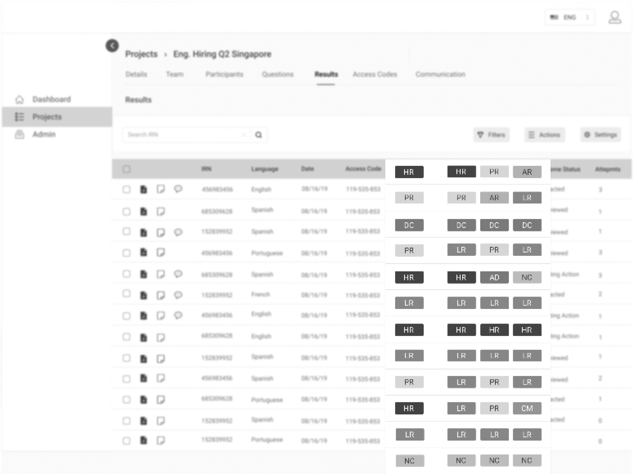
Shades of green used for multiple indicators were indistinguishable in monochromatic vision.
Text inside indicators lost clarity due to small size and low weight.
Visual benchmarking of accessible UI patterns was performed using examples from digital products and adjacent domains such as financial dashboards and stock market interfaces, where fast and inclusive interpretation of high-stakes data is essential.
Key Research Takeaways
Patterns/icons can aid distinction but too many variations risk cognitive overload.
Increasing typography hierarchy and color contrast improves legibility for all users.
Simplicity, familiarity, and consistency are vital for quick recognition.

The background and foreground colors lacked contrast.
Monochromatic view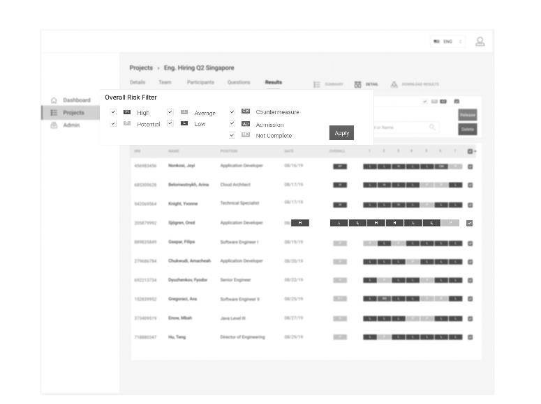
For some, the background colors were faint.
The text on the indicators were too small.
Design Iterations
Iteration One
Explored the use of unique symbols for each risk indicator, drawing inspiration from trend symbols (e.g., arrows for stock movement).
While icons tested well for clarity, feedback from stakeholders highlighted cognitive load and visual clutter.

Use of simple icons to show trends


High Risk

Potential Risk


Average Risk

Low Risk

Admission

Disconnected

Not Connected
Incorporated into the product
Iteration Two (Refined Approach)
Eliminated unnecessary icons in favor of strong contrast ratios, accessible typography, and subtle background differentiation.
Balanced stakeholder priorities (minimal UI disruption) and accessibility principles, creating a lean yet impactful update.
Colors were redefined to meet WCAG contrast standards, and font size/weight were adjusted for clarity.


Refined icons with improved consistency
Final Solution
The redesigned risk indicators now enable colorblind users to quickly interpret results through improved contrast, enhanced typography, and clear visual distinctions, without bloating the UI or compromising the list view’s information density.
Monochromatic view
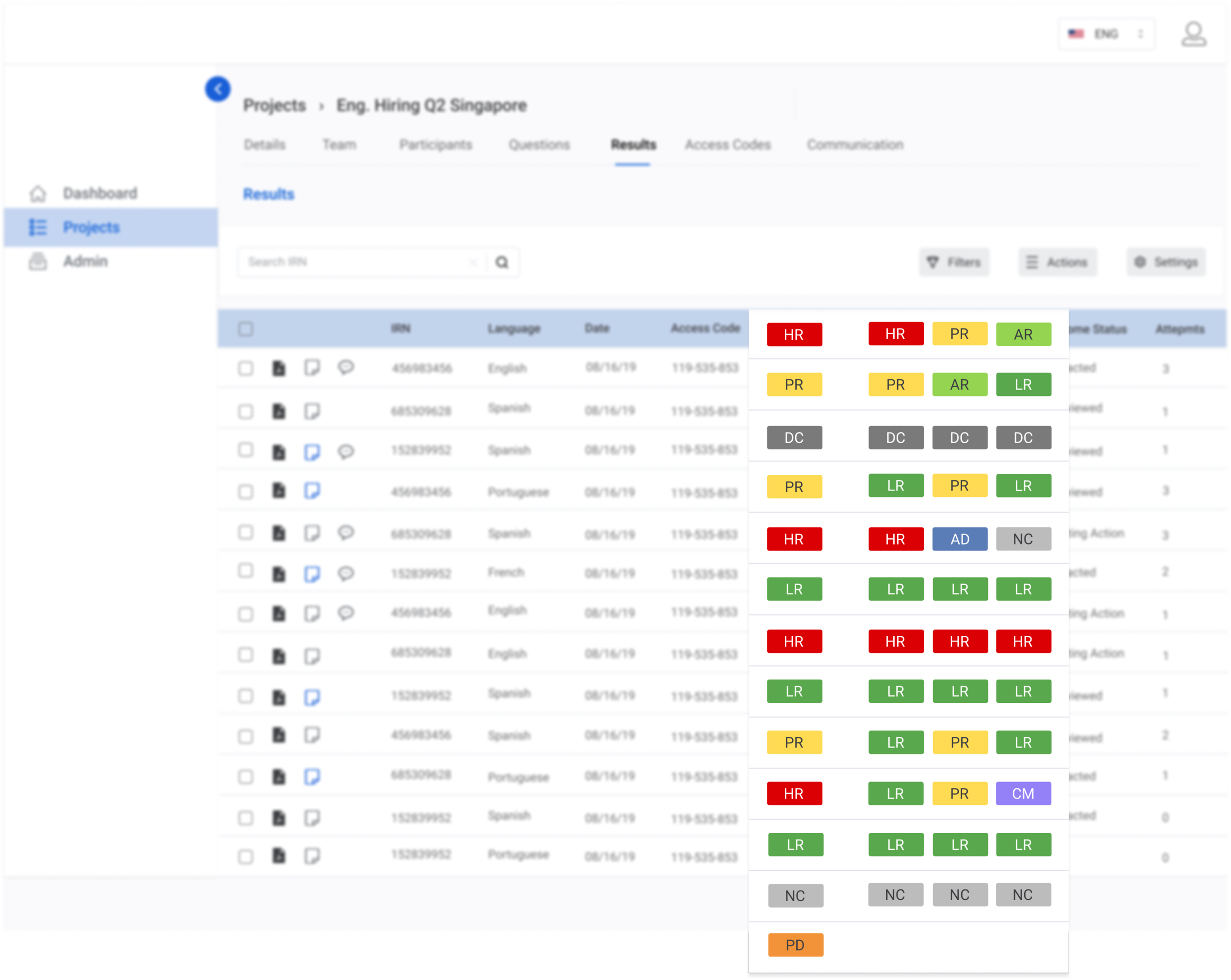
Standard view
Delivered an accessible, scalable solution within tight constraints.
Enhanced clarity and inclusivity of risk assessment, reducing potential user errors.
Improved UX for all users, not just those with colorblindness, by strengthening visual hierarchy.
Impact
Reflection
Found that focusing on strong color contrast and clear typography is more effective for accessibility without cluttering the interface.
Highlighted the importance of balancing accessibility enhancements with spatial and layout constraints for scalable, visually coherent design.
Emphasized the need for early stakeholder alignment to prevent fragmented user experiences caused by late design changes.
Demonstrated that a simple, user-centered approach to accessibility, focused on clarity and consistency, can lead to effective solutions adaptable to other complex AI platforms.